「藍とくしま」のロゴマークは、
組藍海波紋。
ん?💦
意味は想像できるけど、
どう読むの?💦💦
確認すると、
どう読むの?💦💦
確認すると、
「くみあいがいはもん」と読むんですね。
The logo of ”Ai Tokushima" is "Kumi Ai gaiha Mon".
Kumi=combination,
Ai=indigo blue,
gai=ocean
ha=wave
ha=wave
Mon=pattern
I don't know much about art, so
I could figure out the meaning, but I was not sure how to read it
when the word appeared to me at the first time.
when the word appeared to me at the first time.
日本の和柄の中で
とっても人気のある柄💖は
とっても人気のある柄💖は
「青海波(せいがいは)」
青海波の意味は、字のごとく
青い海の波。
青海波の意味は、字のごとく
青い海の波。
徳島のロゴマークは
その青を、徳島の色「藍」に変えたわけですね。
その青を、徳島の色「藍」に変えたわけですね。
”Seigaiha" is one of Japanese popular traditional patterns
"Seigaiha" literally mean the waves of blue sea.
Sei=blue
gai=ocean
ha=wave
"Ai"which means indigo blue is used instead of "Sei" for
the Tokushima logos.
Sei=blue
gai=ocean
ha=wave
"Ai"which means indigo blue is used instead of "Sei" for
the Tokushima logos.
青海波の模様は、
3重の半円の連続で、
波が末広がりに広がっていく感じ。
"Seigaiha"
is a pattern of
continuous triple half-circles.
It is one wave spreads like a fan form shape.
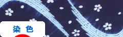
組藍海波紋は、
重なる円や波、そして
白と藍色の組み合わせ。
とても目を引きます。
鳴門の渦潮や祖谷の雲をイメージしているとのこと。
デザインは、野老(ところ)氏
東京オリンピック・パラリンピックのエンブレムをデザインされた方です。
"Kumi Aigaiha Mon" shows
multiple circles and waves.
The color is white and indigo blue.
It is very eye-catching.
It gives you the image of Naruto whirlpools
and the clouds in the Iya area.
and the clouds in the Iya area.
Mr. Tokoro Asao , who designed the
Tokyo Olympics and Paralympics logos,
also designed it for Tokushima.
also designed it for Tokushima.
ちなみに、
オリンピックのロゴマークの
市松模様は、英語で
checkered patternというんですね。
面白い。
By the way,
the Tokyo Olympics and Paralympics Games logo uses
"ichi matsu moyou", which is called checkered pattern in English.
By the way,
the Tokyo Olympics and Paralympics Games logo uses
"ichi matsu moyou", which is called checkered pattern in English.
とにかく、
「藍とくしま」のロゴマーク、とっても気に入ってます。
「藍とくしま」のロゴマーク、とっても気に入ってます。
Anyway, I like the logo of "Ai Tokushima" very much.💖


above is another logo
and bottom is Kumi Aigaiha Mon
上はもう一つのロゴマーク
下が組藍海波紋
にほんブログ村
にほんブログ村
No comments:
Post a Comment